Accessibility is usability
Accessibility. What do we mean by that? For digital people, it means the process of making products and services accessible to everyone. It’s about giving an equal experience to all users, regardless of any impairment they might have.
What about usability? This is a measure of how well a specific user, in a specific context, can use a product to achieve a defined goal.
Now, I’m sure I am not the only one here who sees crossovers between those two descriptions. Accessibility and usability are inextricably linked. If your website isn’t accessible, it simply isn’t usable.

Accessibility = screen readers...
It’s so often the case that when people talk about the accessibility of content, they default to thinking about screen readers.
Hold up. There are 14.1 million disabled people in the UK. Of these, almost 2 million are living with sight loss. And this is only accounting for the people with registered disabilities. What about the people who have temporary impairments, such as a broken arm, or people with caring responsibilities, who are short on focus and time poor?
Screen readers will not cover it. Not even close. There’s so much more we can do to make our websites and digital services inclusive. This is where content steps in.
Inclusivity is structure, format and language
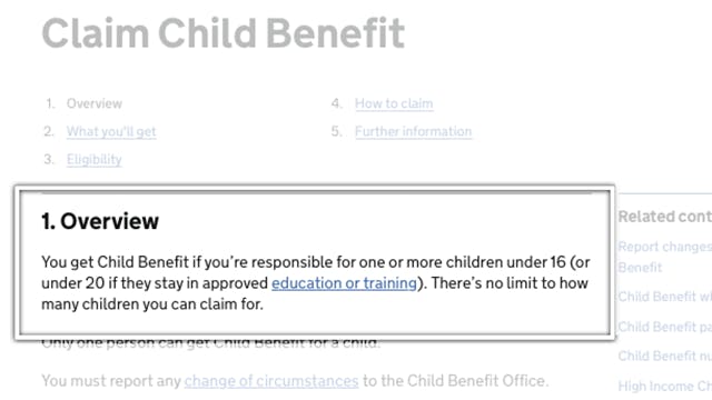
Let’s talk about structure and the F shaped reading pattern. Basically, it takes fewer eye muscles to look down, than it does across. This overview section on the page below is about orientation - “Am I going to get what I need?”

But humans are lazy. If we aren’t getting what we need from the top of the page, that’s when we start to scan and skip down it.
Headings anchor your content and orientate your users
When it comes to usable, accessible content, headings are really important. They help people decide if they want to read all of the content. Your headings can give the story of what’s on that page.
Headings lay out your page structure and prioritise your content. Help people understand what’s important to them by using proper labelling and heading hierarchy. For people with visual impairments, their screen readers will be able to easily tab and zip down them.
No one has time for jargon
When you use specialist language, you are adding extra cognitive load. It will slow people down. In terms of usability and accessibility: it's exactly the same, whichever way you look at it. You can push people away from your content just by using terms that are difficult to understand. So let’s look at an example of this:
“Her presentation is euthymic”
Any idea what that means? Well, me neither. This is a phrase I came across in a psychiatric report. I was helping a friend understand her own court documents. Even in the surrounding context, it still made no sense. It wasn’t explained at all. What could they have said instead?
“She has a normal mental state”
I’m not a psychiatrist so perhaps it was necessary to use the medical term for the court. Fine, just explain what it means the first time you use it. But that’s the thing about jargon and specialist language. We understand it, and we don’t question it. We assume everyone else knows what we know.
Use clear language
Let’s talk about readability and take a look at the kinds of people who would benefit from clear language. It helps:
- people in a hurry,
- people with visual impairments,
- people with cognitive impairments.
White space is there for a reason
Here’s another thing you can do with content. Use space. Designers love a bit of white space. So do content people. From a brain perspective, the more white space people see, the more they think, “Oh this isn’t going to be complicated.”
So here’s how you can use space:
- have loads of headings on a page, telling a story,
- have shorter sentences and paragraphs,
- use lots of different shapes, such as using bulleted lists, to pull the eye down the page.
Accessibility is more than code and colours
With all the settings you can now use in browsers and on devices, you can’t hide behind the developers and designers anymore. You won’t lose people by communicating well. Just by simplifying your structure and using clear language, you can open up your content to a much wider audience.
Hear more from Clare in our recorded webinar session on 'Creating accessible & inclusive content'.
About the author
Clare is a Content Designer at Content Design London. With a background in linguistics and experience in design practices, Clare has a keen interest for all things content, usability, accessibility and language. Throughout her career, Clare has worked across a range of sectors including central government, domestic abuse services and pharmaceuticals. She cares deeply about accessibility and inclusive design, and how the words we use impact experience.